Monday, February 13, 2012
Wednesday, February 1, 2012
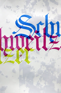
Blackletter Calligraphy?
I decided to put the Copic Wide calligraphy markers I got to good use for my Type as Art class tonight. The assignment is to create a piece that reflected something about our heritage. It was left very open, we could be more personal, or go farther back our family tree if we chose to.
I decided to sort of go both directions. With a very German name like Schweitzer (my mothers name being Schrift, also very German), I decided to do some German blackletter calligraphy with my shinny new markers, use it as a light resist, then screen print it to reflect my more personal heritage (my father being co-owner of Unlimited Screen Printing in Birdsboro, PA since my early childhood).
I'll try to post a high quality photo of the final product when it's complete, so check back soon!
Friday, January 27, 2012
Sunday, January 22, 2012
Final Logo
Just finished the logo design for my senior thesis project. After a couple rounds of revisions and lots of different compositional layout explorations I came to this one. I must say I am pretty pleased with it! It has gone through a lot of changes, but all where ones that I think was for the best. Also, I designed all the typography used in the logo on a side note.
Tuesday, January 17, 2012
Logo for FactionFonts
Just a quick preview of the logo I'm working on for my senior thesis. It's still just a first working draft, so I might decide to make some changes later on. I will be posting the final logo and more previews over the coming weeks, so stay tuned!
Saturday, January 7, 2012
Tuesday, December 27, 2011
Letters, lots of letters.
I think I've found a deep love for drawing letter forms. As I have been working on a font for senior thesis this coming semester (that's a whole other blog post in and of itself), I am slowly realizing how intriguingly complex the design of a letter form can be and just how much work is required to make a good one. So many things need to be taken into account. Balance, weight, over-all consistency and the simple factor of whether or not all the letter forms look good and work well sitting next to each other, are just a few things to consider. All of these elements that need to be considered seem to create a complex equation of sorts that can only really be solved fully by eye-balling it and going with your design gut.
I don't know why I found I like to draw letters as much as I do, maybe I'm getting older and find a deeper appreciation for the more subtle design cues that can be found in individual letter forms, that either make or break an entire font. Maybe it's because a little bit if the inner OCD in me gets to shine through in the process, or maybe it's just because I'm back to drawing again like an excited little kid, something I have sadly been growing away from. Whatever it is, I feel like I am just that most of the time while I am drawing these little letters, an excited little kid drawing pictures. Isn't that what it's all about anyways?
Here's a preview of just one of my upcoming fonts that I'm designing for my senior thesis. I'm extremely excited about this upcoming semester and all the things I have planned, I don't think I've been this excited about a project in good long while, that's saying something. I plan on posted a lot of blog entry's all along the way, so keep checking back for progress updates and preview shots of what I'm working on.
Subscribe to:
Comments (Atom)


